Proposal

Title – narrative (hows life?)

Area of investigation – peoples responses to a simple, non-descriptive question.
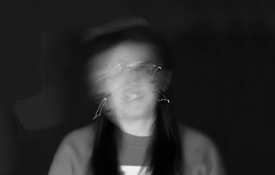
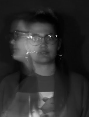
Using a long shutter speed to create movement in the photos. Taking portraits.

Research –
    Photographers:
·      Richard Avedon
·      Francesca Woodman
·      Samantha Geballe
·      
     Vivian Maier


This photo is not about the location for me as I would want use a more rural background and this photo is more the poses of the models. Being centred in the photograph. This is a style I would like to visit.


Tom Ziebinski

Image result for tom ziebinski


Tom Ziebinskis photography is the sort of photography I want to create, but mine also to be a bit more minimal with the movements, with only a couple of movements in my photo.


https://crominski.wordpress.com/tag/movement-photography/ - long exposure photography portraits using light along with the long exposure.


Trying to communicate - I want to models answers to be messy with mistakes, just like if you were writing a note. This will link to the also messy look of the photographs with the multiple movements.

Form -
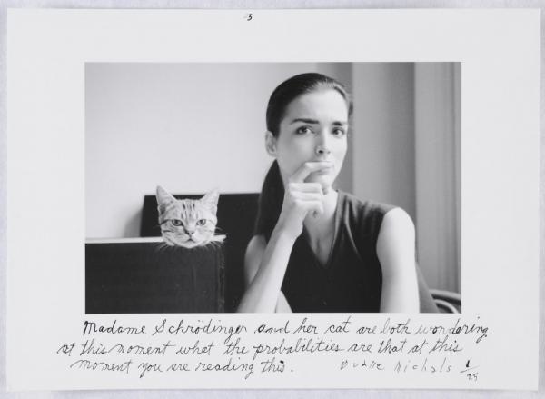
Idea 1: at least 4 photos printed a3 size print, with white borders to have the model write their answer on. (inspired by Duane Michals). Also to get the models move around for how they are feeling.
Idea 2: at least 4 a3 size prints, with each models written answer under each of their photos.
Idea 3: at least 4 a3 prints, not using the written answers.


Timetable – find 10- 15 people.
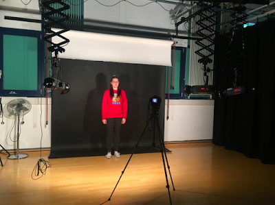
1st photoshoot – Tuesday 16th October 11am studio booked(dark side)

Models:
Sarah Lane
Matt
Emily
Becky

Budget - £100

Location – Either the studio (white or black background) or a simple location like a brick wall, or a woodland area.


Equipment needed – DSLR Camera, tripod.


Different types of Narratives

Circular Narrative:
Image result for circular narrativeThis narrative has the same beginning and end. Can be in mythologys, 80s cinema, and also in the Alice in Wonderland book. Todorovs theory of narrative was narrative is driven by restoration of balance, with the 5 stages; Equilibrium, Distruption, Recognition, Attempt to resolve, New equilibrium. This theory was created in 1969, by the Bulgarian French Academic.
Adavantages - 
The completion of a circle
Satisfying
Enter at any point in the circle
Disadvantages - 
Image result for rineke dijkstra almerisa seriesSome people like a story to have a beginning, middle and end
Frustrating
Has to follow chronilogically.

Linear Narrative:
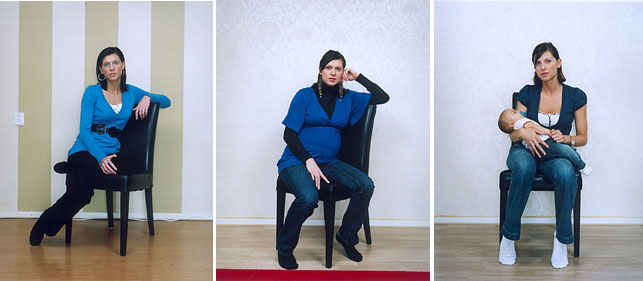
This narrative has a start, middle and end, and can be in storybooks and soap operas. A photography example is Rineka Dijkstra.
Advantages- 
Easy to understand
Build tensions
Disadvantages-
Uninteresting
Basic and predictable
Image result for duane michals series

User Defined Narrative:
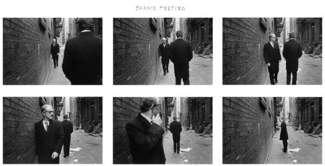
This narrative can be split into two sides, and can be seen in films like the impostwe. A photographer is Duane Michals.
Advantages -
The user is in control of the narrative offering them freedom 
Disadvantages -
Can be left open ended
Might not get the message across


Image result for man rayDe Centered Narrative:
This narrative is that you remove or replace the subject from its central role, which has been used by woody allen. A photographer who uses this was Man Ray.    
Advantages -
No clear theme or structure so more ambiguous
Disadvantages - 
Confusing.


Non Linear Narrative:
This Narrative doesnt work in a sequence or chronillogical order, and is used in films such as; pulp fiction, dunkirk and toy story. A photography example is Cindy Sherman.

Image result for cindy sherman


Duane Michals

Duane Michals is an American photographer. He creates narratives within his series'. He also uses text around the borders of his photos, creating stories. I like his work "things are queer". Where he used 9 photos to create a narrative.
Image result for duane michals things are queer
You can see the story clearly in his work, with his narrative being user defined. Meaning it has been split into two sides. I really like the layout of his work, being very uniform, and I would say is like a storyboard. I like that the photos are a story but also can be seen seperatley and would not make sense, and would almost create their own narrative.
Image result for duane michals

In some of his work he has written around the borders, telling you a bit about the photograph. This is what inspired me with my work to get the answer to hows life? and would like the people in the photographs to write around the borders of their photos, to give more of a personal feeling to the photo. I thought about writing all the answers myself so they would be more uniform, but I feel getting the person photographed the rewrite their response on their photograph, will be more effective, or even another person, I just feel all the same hand writing would not have the same effect.

Victor Song


Victor Song studied fine arts with a minor in photography at Carnegie Mellon University. He created the series "blur" to play around with different shutter speeds on his camera. He combined different flashes and long exposures to make different kind of portraits.


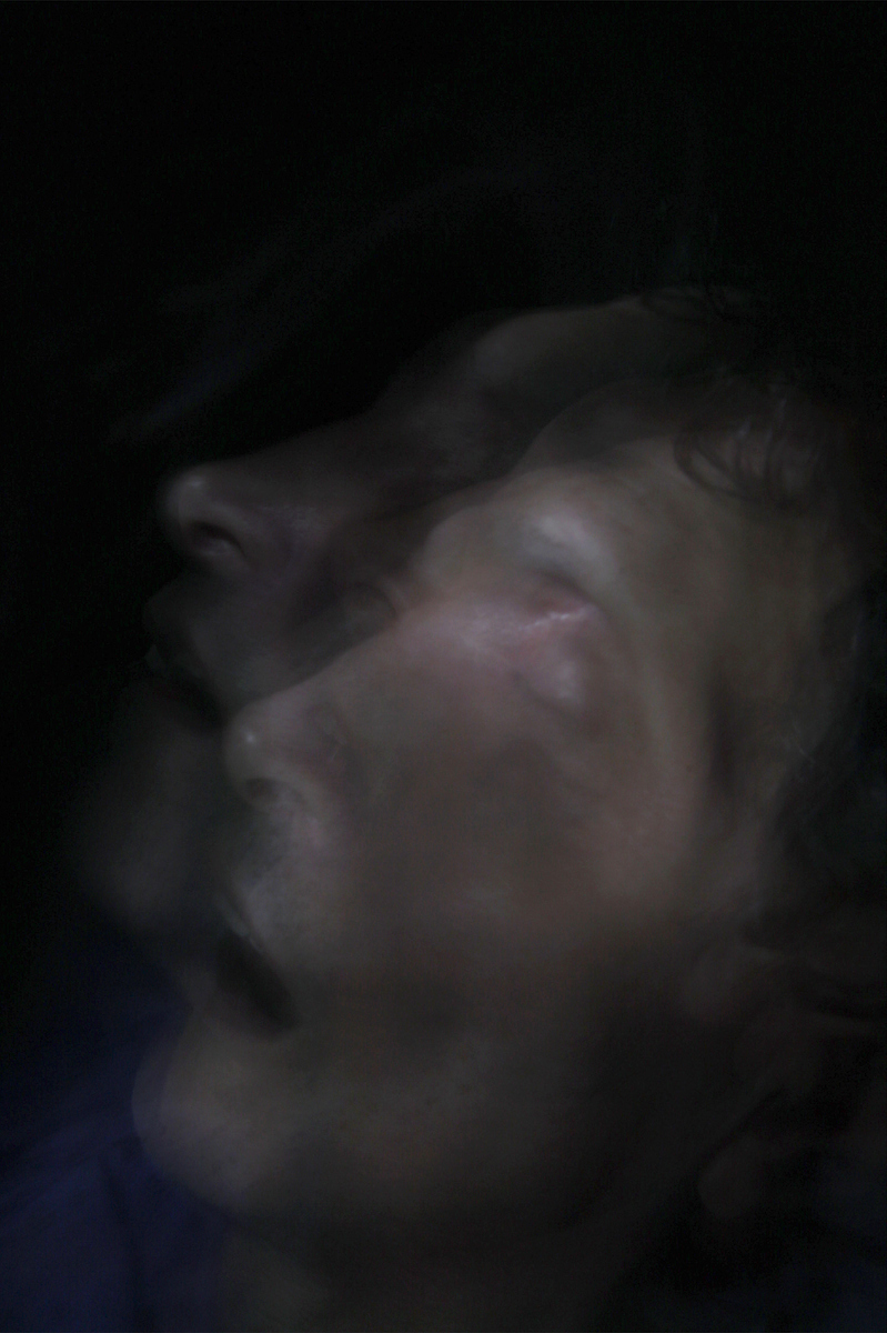
I love this photo, because of the uniqueness. The abnormality of the face with the movement. You can see there is only one movement in this photo, and that is with the mouth. It gives a sort of demonic feel to it. I tried playing around just one single movement in my work, but it just didnt give the same effect and feel longer movements would be more effective in my work.


This photo is similar to one that I have already taken with the head movement, creating a double face.  Mine is a portrait and shows the models full body, but my photo could also be cropped to the same ratio as Victor Songs photo. I would like to maybe crop my photos for this for my final photos.   I like these photos because of the only movement being the head and the shoulders and neck are still, and completely sharp, I would like to try and get the more sweeping motion like in Victor Song's photos, whereas mine is more just still movements.

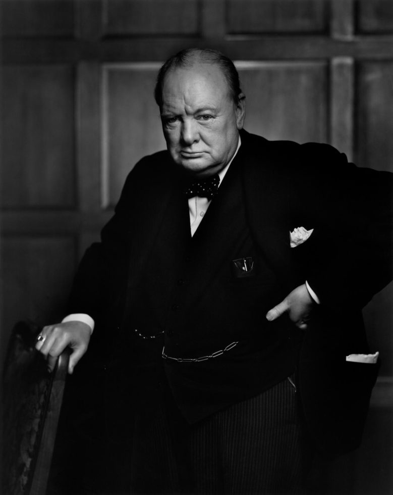
Yousuf Karsh

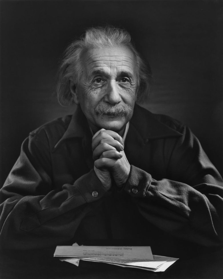
Yousuf Karsh was an American Canadian photographer and was known for his portraits of very well known people. He has been described as on of the greatest portrait photographers of the 20th century. These photos don't necessarily go with the idea I am trying to create, because there is no movement within them, they are still portraits. I like the non expressive faces that his subjects have, giving you no idea of how they feel. This made me think about how I can create a lot of motion in the photo getting stills of different emotions. His Black and white backgrounds and tonal ranges are what I would like to achieve in my work. I also like the amount of body you can see in the photograph, being closer in and the sheer focus is on the subject, bringing closer into the face. 


Image result for yousuf karsh

Blythe Bohnen

Blythe Bohnen was born in Evanston, Illinois,  She is was one of the founding members of A.I.R. Gallery, a women's cooperative arts organization. Bohnen began her career as a painter, and in her paintings and drawings of 1968-73 she explored the effects of physical gesture and examined how bodily motion affects artistic production. She first used a camera in 1974 to photograph her hand and arm in motion, in the process of making art. Her photographic self-portrait series from the early 1980s continues on themes of motion and identity.
Related image
I like the uniqueness of this photo, with the movements creating a distorted face, giving a sort of scary nature. I like this in black and white because you focus on the movements rather than the details of the colours. From this photo I thought about using a white background but after doing a shoot with the white, have decided the black background shows the movements off more for me and also I feel gives more of a dramatic look.
Image result for Blythe Bohnen
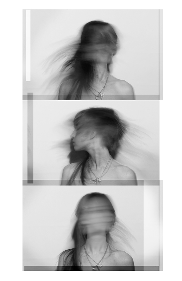
I like this series of photographs, showing the model during different movements. I feel it gives a bit of photobooth feel to it, with the images going down vertically. I may consider doing this for my final prints, whether its the same person or different people, I really like the layout. Once again I like the photographs in black and white, make you focus on the shadow movements alot more.


This photo reminds me of Bylthe Bohens' work with you not really being able to see the models face but being able to tell it is a person. Giving the person no identity, the way I want my photos so anyone can identify as the person in the photo, feeling their own emotions when they see the photo. 

Gillian Wearing

Gillian Wearing was born in 1963. She is an English conceptual artist, and is a winner of the Turner Prize. Gillian Wearing was elected as a lifetime member of the Royal Academy of Arts in London. Her statue of the suffragist Millicent Fawcett is on London Parliment Square.Image result for gillian wearing biography


Gillian Wearings photographs from this series are what inspired me to get peoples repsonses to a simple question on a piece of paper. To go with their photographs. I don't want to answer in the actual photo like hers, but have thought about getting the model to write over the final print inspired by Duane Michals, with him doing this over his work.

Image result for gillian wearing biography
I like that the photographs show the different writing of each person given each photo more personality. Some of the answers I got are below, which have been scanned in. I decided to let the models write as little or as much as they liked. Giving them more freedom and also not to over think their answers. To improve upon this area of research I am thinking of asking them at different times during the shoot.

Vivian Maier

Vivian Maier, was born on the 1st February 1926, in New York, and died the 20th April 2001. She was an amature street photographer whose full time job was a nanny and photography was just a hobby, with her creating a large body of work, that became a sensation nearly 2 years after she died, where her negatives and undeveloped rolls of films were found and she became famous.

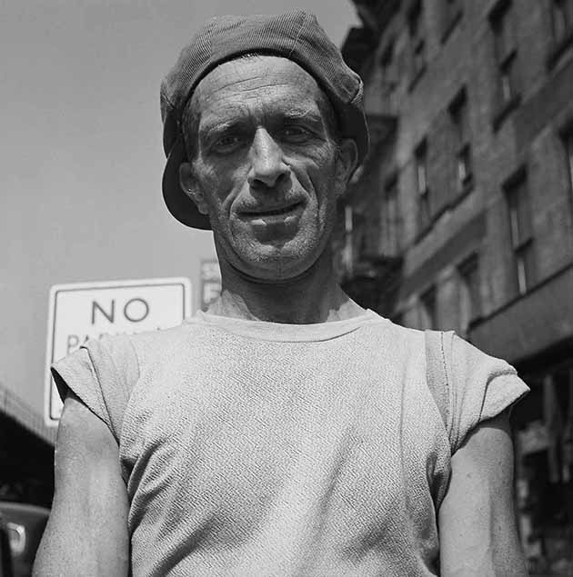
I have always been an admirer of Maiers work, especially her self portraits. But with this project I like her street portraits. I feel like her compostition of her street work inspired my work most, with the out of focus background, and natural expressions on the subjects face.


The compostion of this photo, with the body being cut off and not being able to see the subjects hands, is the compostion I am considering for my work. I also like how the subject is looking down the lens making direct contact with the viewer, I want to bring this into my work, to make a connection with the audience.


Image result for vivian maier portraits


Once again the composition of the photograph is what I would like to achieve. With the lower body being out of frame. Even though my background will not be as detailed as this one, I like the amount in this photograph with the arms being at the edge of the frame.

Kitra Cahana


Kitra Cahana was born in 1987, is a freelance documentary photographer, and contributes to National Geographic magazine. She has many awards, and her work that most inspired mine was her work of her father called 'still man'. It started when her dad had locked in syndrome, where Cahana photographed him slowly moving again creating the movement with her helping him as well. It shows the experience for both of them in different ways but connects together through the movements. It shows the emotions just like my work, and shows almost the mess form the emotions.

Image result for kitra cahana still man


This work is the closest photograph to the ones I have photographed already; with it focusing on the face and not the body, it also only has slight movement which in some of my photos can be seen especially in a shoot with my model Emily.


KitraCahana-02.jpg


This photo does not coincide with my work, but I like it a lot with the movement being in the whole photo and just a faint figure of the dad in the background. Even though the photo is all distorted it still is easy to see what the photograph is.


Elena Oganesyan

Elena Oganesyan was born in 1979, and is from Russia. She didn't start photography until 2008, before that she was in publishing. Most of her work is long exposure, and she explains it as; "the whole process of shooting with energy, every second of it. It feels like catching a moment, being in contact with light and human body, watching them tranforming in an incredible way and you are not in control of this tranformation. It seems like someone else is there working with you." Her work creates  the feeling of multiple people being there.
Image result for Elena Oganesyan

I like this photo because of the feeling it gives you, with the model looking into the camera, the subtle movement, it gives you a serene feeling. Its a soft image. I also like the colours in these photos.


Image result for Elena Oganesyan


I want to try and acheive a photo similar to this with the hand over the models face, but still being able to see the face through it. Given the photos dimensions, showing what you can do with your camera.

Tom Ziebinski

Tom Ziebinski uses long shutter speeds to create is work "modern drag downs", which is my main focus and inspiration throughout this project. His work is simple, with elegant movements, showing off the humn body in a different way.

Image result for Tom Ziebinski

His work is the sort of work I want to do with the movements of the body, and the pure black background. The lighting focused on just lighting the subject and not the background. gives that sharp 
look. I have tried the movements of hands in my work, in not such a clean way but it gives my photo wider angle to it.


Image result for Tom Ziebinski

With this photo I like the face being amongst the movements of the arms and legs. It leads you into the photograph and the face being the focal point. I want to try and create more movements within my photos like Tom Ziebinski's rather than Suzanne Lafonts works, as I feel his work is more the approach I would like to go down.


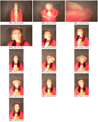
This is my Ziebinski style photo, I feel like this was one of my strongest shoots as the model moved around a lot more and was more relaxed and not awkward or stiff. I feel like the movements are very similar to Ziebinski's, the only thing I would improve on is to make the background darker.

Test Shoot - MOLLY


This test shoot was to get use to the style of photography, I just wanted to try movements. Using my model Molly, I got her to move her arms around. From this shoot I need to get less light on the face with as it is very overexposed. To work on this I need to change the settings of my camera. And also try using just one light over two so it is not as bright on the model.


This is the first photo I have edited, I edited in colour as feel that I want to go down this route. I need to work on lighting the models face, with my model being slightly orange in these photos. But I am not bothered about that at the moment as this is for getting the movements, and I can work on the lighting in a later shoot.


Shoot 1 - SARAH


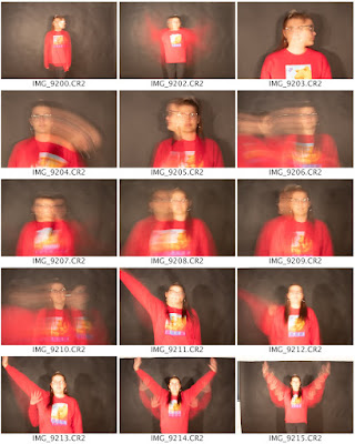
This shoot went well, with the movements. However I feel the black backdrop is very bright, this can be fixed in photoshop, and also as I am changing the photos to black and white so the background will get darker with that. I decided to photograph in landscape to get more of the background around the model to give me more to work with. I enjoyed shooting this person, as they were willing to more as much as needed, creating photographs with alot of movement.


I used three lights which I now have decided that is too many lights, with the background being the washed out. The light was on F5.0, the middle on F5.1, and right on F6.7.


Difference between colour and black and white photos:


I have decided to start looking at whether or not my photos should be in colour, as I they do not have the same effect as the edited black and white versions. It gets rid of the detail and focuses more on the movements.

Edited photos:

This photo went well with the dark background and the abnormal movement, I like that I got the face in within the movements to give the photo a center.


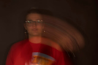
This photo is interesting to me with it being cropped close into the models face, but I am not sure if this would look better in landscape with more background around the model. I also would try it without glasses as the light reflects in the models glasses.

Feedback 1


From this feedback form, I have decided to get more people out of my friendship group, and have asked students at the university through facebook if anyone would be willing to model for me. From this I have had a few responses, and will be photographing them. I have also printed off some example of the other shoots I have done to give the models an idea of what I want them to do. 
I have decided not to construct the reply's to the question hows life, as I want the models answer, as I feel it will tell you more about the photo. 

Further Notes: 
I have decided to go with a black backdrop as after seeing Tom Ziebinskis work, I feel it would make it look more dramatic.
I am still not sure whether to have the photographs in colour or in black and white, as I feel black and white will make you focus on the face of the model more, because you are not distracted by the models clothing or other colours in the photo. It also makes everyone neutral.

Proposal

Title – narrative (hows life?) Area of investigation – peoples responses to a simple, non-descriptive question. Using a long shutter ...